
Bottom Line — Content begs for easy readability. Think about if your text size is too small and therefore hard to read for the average reader.
Updated in 2020: I broke this rule with my current blog. However, modern browsers have a reader button that allow you to resize text as you need it to.
Responsive web design allows me to resize and redesign a page for specific devices. It means I’ll be setting a smaller font for a smartphone and a larger one for a 24-inch screen.
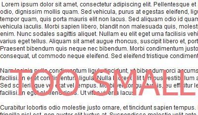
Tell me, why the hell do some web pages continue to use 10px font sizes for all views? You almost always have to manually zoom in using your browser, and then some other elements on the page will block the article you’re reading.
It seems as if web pages continue getting smaller and smaller font sizes. I’ll go to a website to read an article, or perhaps the news, and I realize that my head needs to be one foot away from the page to see the font. This is too close and strains my eyes. I can’t be only one who uses ctrl + scroll wheel to increase the font size of almost every website I visit.
Material Design: Book Example
We’re used to reading books, and the majority of books have a larger font size than your average website. I can hold a book 2 feet away and my eyes won’t strain. The trend has been to go with font size 10 or 12 pixels. Should we use larger font sizes? Yes, if you care about readability.
Examples
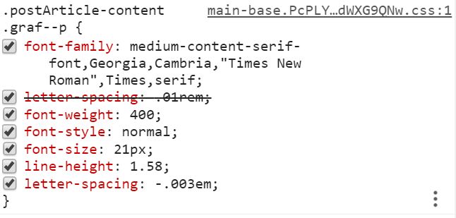
Look at medium.com. I use this platform to publish articles. The font size is 21px on a monitor. It’s easy to read.
Another inspiration is iA.net written by Oliver Reichenstein, who talks about web design usability. Specifically, his article on 100% easy 2 read standard mentions the pitfalls of small fonts for people who actually read from a computer screen.
Originally browsers had a font size of 16 pt, which is 100%. If you take a look at iA.net, you’ll notice how the font size is 100% and it is quite easy to read. The typography is well laid out and is enticing to the reader.
Personally, I think 16 pt is still a bit small. 20px is about right for my eyes that are 3 feet from the screen.
Not always, but in general, content is king. Content begs for easy readability.
In a Nutshell
Try to emulate how books would look like from two feet away. Having a larger font size increases readability and will attract reading audiences for longer periods.
Originally published at www.basicdrop.com on September 15, 2014.